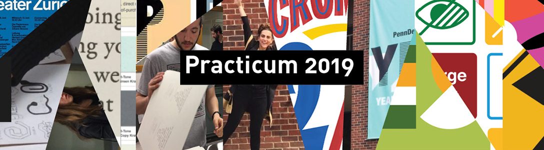
Edit the Farm to City powerpoint here
Author: jenniemchen
AAAI logo
Someone sent me an email re the Association for the Advancement of Artificial Intelligence (AAAI) this morning, and their logo is reminiscent of the one designed for TAIRIS though theirs feels much more academic than high tech. I thought it was fun how they transform their logo for the various conference locations every year.


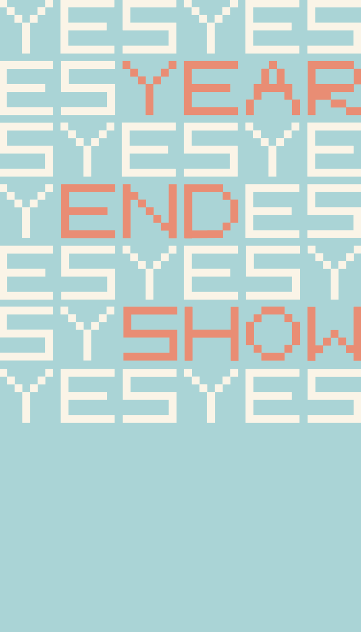
YES Banner v2
YES Banner Sketches
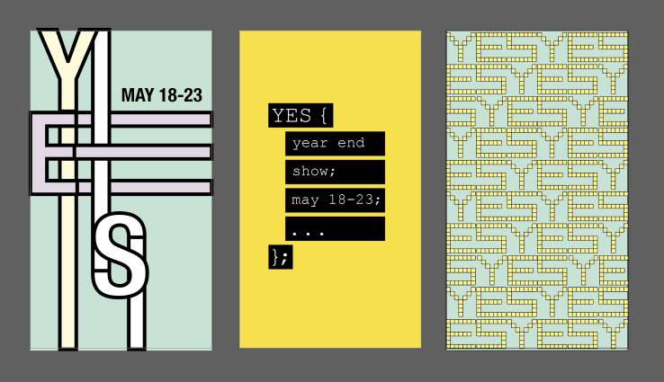
The illustrator file is on the server
Jennie Capacities Statement
I’m an optimist, a pragmatist, and a problem solver. I believe that people fundamentally want to do good and that technology can be used to drive positive change. However, I ground my optimism in realism. I try to learn about different backgrounds and perspectives so that I can understand which critical issues need to be solved and the barriers to enacting change. As both an engineer and designer, I can approach complex problems from different angles, break them down into more manageable subproblems, and then synthesize these pieces into a deliverable solution.
More Poster Inspiration
Corita Kent:


Grapus:

Steve Frykholm:
Atelier Populaire: Poster Inspiration
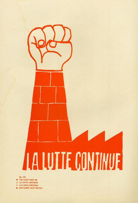
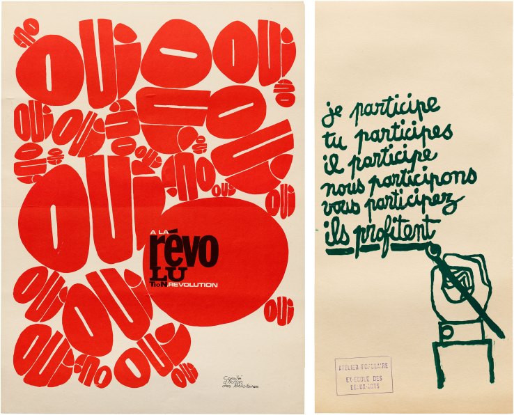
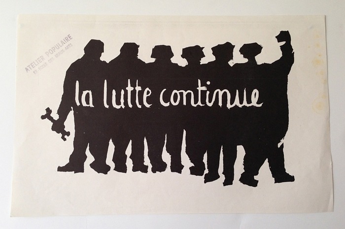
In 1968, “student[s] and worker[s] protest[ed] against rising unemployment and poverty under Charles de Gaulle’s conservative government in France. Students and faculty at the L’ecole des Beaux-Arts took over the lithography studio and established the Atelier Populaire (the Popular Workshop). Their collective produced hundreds of pop-derived silkscreen posters, which remained an object of obsession for the art world.” (source here)
Kleiner Perkins Portfolio
Kleiner Perkins is a venture capital firm headquartered in Silicon Valley. On their website, their portfolio companies are split into consumer, enterprise, hardtech, and healthcare categories. After completing the PCI logos project, it was really interesting to scroll through the logos of Kleiner Perkins’s portfolio companies and see the various approaches to designing logos for these modern businesses. Some of their consumer products can be viewed below, and their full portfolio can be viewed here.

Burger King’s Andy Warhol Ad
During the Super Bowl, an advertisement for Burger King featuring Andy Warhol was aired. The video clip, co-opted from Jørgen Leth’s 1982 documentary, 66 Scenes From America, starkly contrasted the approaches of other advertisers.
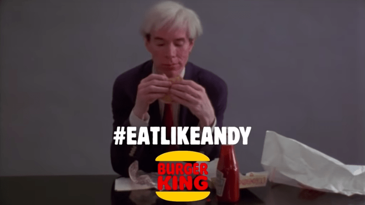
The full advertisement can be viewed here, and an interesting opinion on the choice to use the Warhol clip can be read here.
BCG Logo Change
Last fall, Boston Consulting Group updated their logo and brand identity. Switching from a serif font to a more rounded, sans serif one and dropping ‘the’ from their name, BCG is signaling their ability to innovate in a increasingly technological landscape. However, their new logo oddly already appears dated and removes the reminder of the tradition and ethos of the company that the old logo held. This was one of the more drastic brand identity shifts I’ve seen within a corporate industry, so I thought it was pretty interesting choice.
![]()
More images of the old and new branding can be seen here.
