Typography is definitely something I am trying to learn more, and this seems to be a cool website full of inspirations!
BCG Logo Change
Last fall, Boston Consulting Group updated their logo and brand identity. Switching from a serif font to a more rounded, sans serif one and dropping ‘the’ from their name, BCG is signaling their ability to innovate in a increasingly technological landscape. However, their new logo oddly already appears dated and removes the reminder of the tradition and ethos of the company that the old logo held. This was one of the more drastic brand identity shifts I’ve seen within a corporate industry, so I thought it was pretty interesting choice.
![]()
More images of the old and new branding can be seen here.
Creating Lasting Signs of Danger

This video, called Why Danger Symbols Can’t Last Forever, describes the process used to design common warning signs that will need to last for centuries or more (in radioactive areas, for example). However, the meaning of these symbols can change over time as associations develop between them and more lighthearted ideas, such as the association of a skull and crossbones with pirate treasure. Therefore, designers came up with alternative ways of warning against danger, such as spikes to create a threatening environment surrounding the radioactive area, visual depictions of what will happen if a person enters, or organizations specifically tasked with passing down knowledge.
PCI Sign-Ups
10+ Mockups for each 🙂
The gift of giving
I have attached a photo album of all the gift photos here
https://photos.app.goo.gl/XQveaNVVLR5qvQiDA
“[The gift] is concrete or evident proof that the giver knows, and has understood, recognized, affirmed, and sought to concretely meet the other’s most intimate needs and desires.” – The Gift, Clive Dilnot
Illustration Inspiration
Here is a website to search for icons (similar to the Noun Project). It can help visualize how you can simplify objects into understandable illustrations with a desired aesthetic.
![]()
The “Jazz” Aesthetic
I was very intrigued by this video because it showed how a few people with a distinct eye for design was able to create an distinctive look for an entire genre.
Library of Congress New Logo
I stumbled upon this website and thought it is interesting how so many people hate the new logo for the library of congress.
I think it’s actually not bad given it is dynamic and works with different mediums. But let me know what you think!
Dynamic Identities
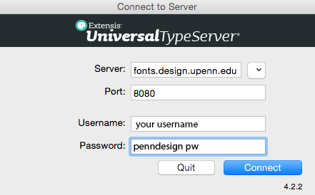
Course Folder, Type Server, Nouns
Access the Course Folders – – from pull-down menu: Finder > Go > Connect to Server


Access to the Fine Arts type library is available via the Universal Type Client – login with username and PennDesign password.