Farm to City Presentation Intro

Frame the presentation around the mission statement Bob defined for us: “to unite communities, families, and farmers year-round through good locally grown food”

  • We crafted a bit of a 2-part design solution to achieving that mission:
    • Part 1 (uniting communities): Establishing more of an environmental presence outlines a space of communal interaction, that is centered around the market / food / fruits of the farmers’ labor
      • Bonus: additional merchandise and activities (?) embedded within to facilitate fostering interaction in fun and creative ways
    • Part 2 (year-round relevance): a social media plan and programming that will extend the market’s fostering of engagement with the Philly community beyond the physical market space

Continue with the rest off the presentation –> Success –> Celebrate

Note from Deb

The specs for the various digital signage options are below:

Penn Libraries signs: Size: 1252px x 939px (4:3 aspect ratio), File formats: Multiple .jpg, .pdf, .pptx, .png, .gif, .tif, Installation: Uploaded through virtual desktop and onto computers running Four Winds Interactive sign player (full info:https://guides.library.upenn.edu/digital-signage/tools-resources)


Penn Museum signs:  (will send ASAP. Trying to find someone who knows since the person who knew them best is out on paternity leave…)


Campus-wide Penn Video Network Bulletin Boards: Size: 1024×768 px, Resolution: 72 or greater, Color mode: RGB (best for TV reception) or Black-and-white
Orientation: Horizontal (vertically-oriented graphics will have to be re-formatted for proper viewing)  (fuller info: http://www.upenn.edu/video/vbb.html)

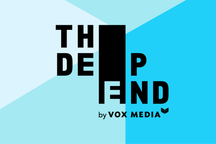
The Deep End by Vox Media

chorus_header_1800x628_blue_preview.0

Not pictured: the tagline, “Jump in”

The Deep End was this panel at SXSW that entailed “three days of unfiltered storytelling, live podcasts, musical spotlights, selected food & drinks, and immersive experiences, all designed to ignite your curiosity“.

I love the bold/playfulness with the type and having the E drop throughout the three words but still read clearly. It immediately piqued my interest when I first came across it last year, which aligns with the company mission of igniting curiosity and encouraging exploration, so I’d say this design is a success in my book.