I am a choreographer of harmonious complexity. I believe that numerous components can be brought into unity without detracting from one another. The question is merely how to organize them into layers of meaning so that the person experiencing the design may zoom in and out, taking in more or fewer layers according to his or her own needs, which I would not presume to limit. My specialty lies in answering that question through hierarchy, pleasing rhythm, and devoted craftsmanship. No task is too daunting for me, because I love this challenge and do not require much rest from what others might consider hard “work”. I consider it play. My ideal project would be one of endless layers of meaning organized into harmonious structure, creating beauty and revealing function in their interplay, like an infinite fractal. The richness of a design need only be limited by the resources available to create it and the needs of the people who consume it. Give me these inputs (which I will listen to with care), and I will reliably generate results.
Author: staradiamond
Inspiration for Rebel Ventures
 c
c
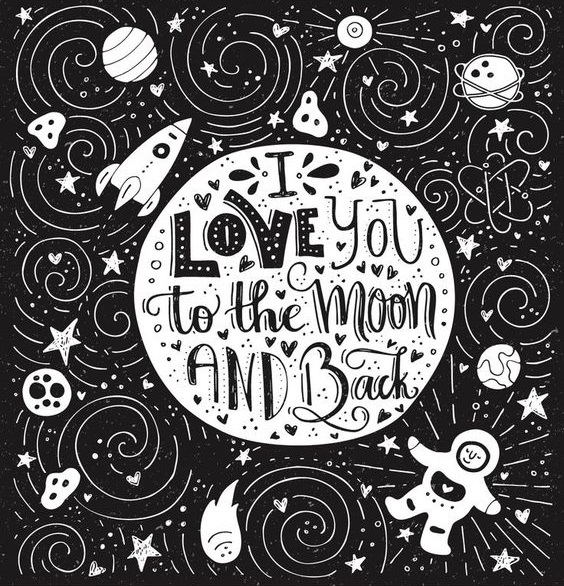
Above: Both found on Pinterest, artists unknown

Above: Found on Pinterest, by Favete Art on @creativemarket

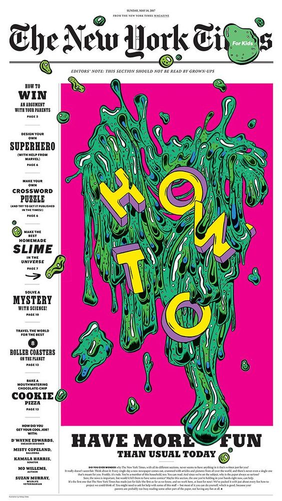
Above: Found on Pinterest, by Kelsey Dake
Left: Found on Pinterest, Jay Roeder “World on Fire” hand lettering typography design poster.
Right: Found on Pinterest, phone wallpaper from Untouchables
Visit to Avril 50
After browsing the selection at Avril 50, I decided to take a picture of this volume about design called Soffa. The pastel pinks on the lettering pop against the black. The inner pages contained many dark backgrounds next to light backgrounds, providing a pleasing contrast. I also enjoyed the wide margins, as well as the thoughtful font sizes.


Entrance Examples
This article lists some entrance designs that (although they are intended for homes rather than a more public space such as a museum) might mix well with the brutalist style of the library. Horizontal lines that appear to slant toward the entrance seem particularly appealing.


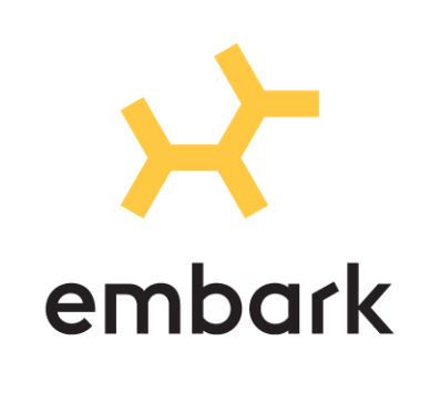
This clever design for a canine DNA testing company was posted on Brand New. I thought that it might be useful for those of us that are working on Vetigenics. Perhaps there is an alternative solutions to be found by making a DNA strand look like an animal, rather than housing animals inside of it.
Creating Lasting Signs of Danger

This video, called Why Danger Symbols Can’t Last Forever, describes the process used to design common warning signs that will need to last for centuries or more (in radioactive areas, for example). However, the meaning of these symbols can change over time as associations develop between them and more lighthearted ideas, such as the association of a skull and crossbones with pirate treasure. Therefore, designers came up with alternative ways of warning against danger, such as spikes to create a threatening environment surrounding the radioactive area, visual depictions of what will happen if a person enters, or organizations specifically tasked with passing down knowledge.


