The Deep End by Vox Media

chorus_header_1800x628_blue_preview.0

Not pictured: the tagline, “Jump in”

The Deep End was this panel at SXSW that entailed “three days of unfiltered storytelling, live podcasts, musical spotlights, selected food & drinks, and immersive experiences, all designed to ignite your curiosity“.

I love the bold/playfulness with the type and having the E drop throughout the three words but still read clearly. It immediately piqued my interest when I first came across it last year, which aligns with the company mission of igniting curiosity and encouraging exploration, so I’d say this design is a success in my book.

The Influence of Barbara Kruger’s Iconic Typeface

When I first saw Barbara Kruger’s artwork at The Broad Museum in LA, I can’t help but notice its similarities to the Supreme logo, and many more that use some variation of the bold oblique typeface.

kruger_your_body1200px-Supreme_Logo.svg

As we’ve discussed in some earlier posts, many companies are shifting to this type of round, modern typeface. Aside from our discussion on modernization, one interesting perspective is the influence of traditional art on commercial product design. Case in point, Kruger’s work inspired the Supreme logo despite different meanings embedded in the work and the brand respectively.

Modernization or the Loss of Individuality in Fashion?

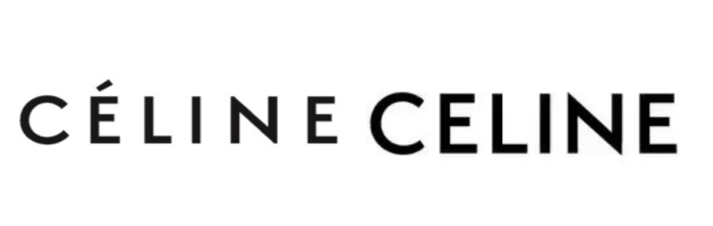
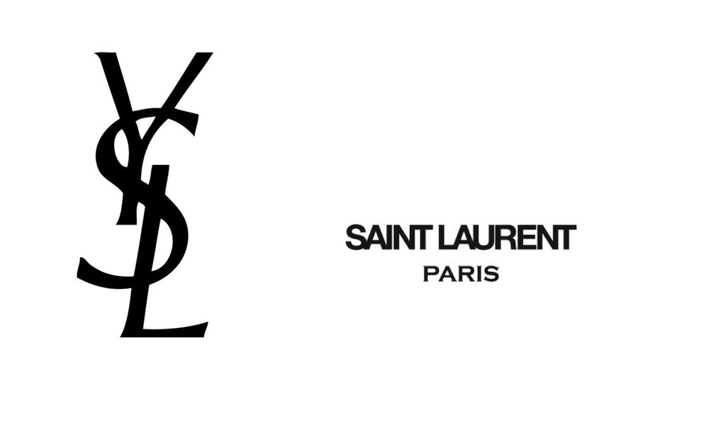
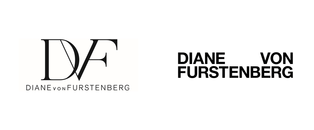
Over the past couple of years, consumers have started to notice a pattern of rebranding for some of the top names in fashion. It seems as though designers are shifting towards a general ‘bold, all-caps, block font’ to represent their newest designs. This got me thinking as to why this might be?

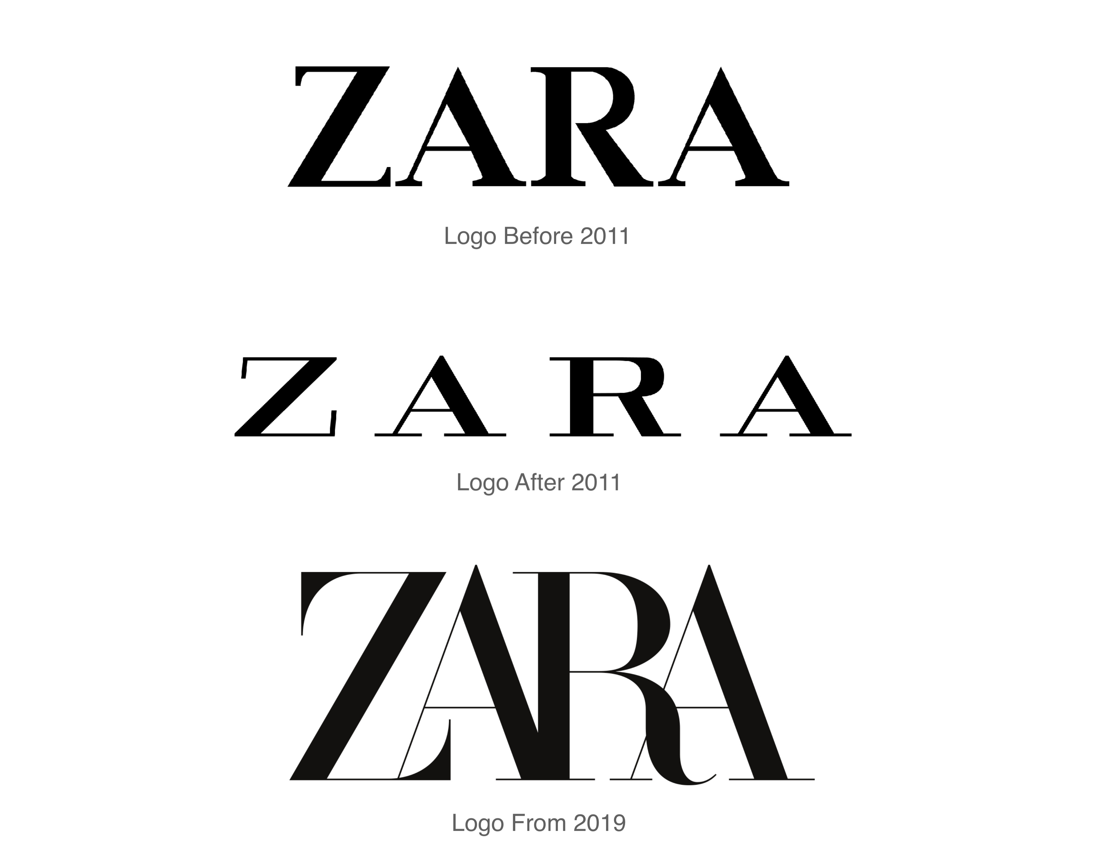
This re-branding pattern goes against my natural assumption that fashion brands would want to do anything in their power to stand out from the ever-growing list of names in fashion. So, why this sudden transition towards uniformity? Burberry, for instance, released its new logo late last year after over 20 years of the old logo that the company’s consumer base had grown to love. burberry_logo_before_after_a

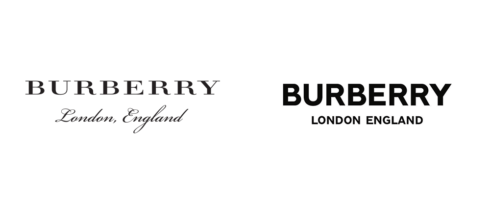
My guess would be that name brands are trying to broaden its client base by generalizing their logos, hoping to appeal to a younger, more modern audience. This may be one possible reason for the change in marketing direction for many of these companies. I’m curious as to identifying the factors that drive these changes and if it has any real affects on a company’s client base or popularity.

cel

sl

I was surprised to find out some rebranding strategies have actually been met with a lot of controversy from the public. Gap, for instance, returned to their original logo in less than a week of releasing their new one, back in 2010 due to extreme backlash from its loyal consumers. Whereas, it seems as though consumers are more appreciative of rebranding initiatives when there is a story or reason connected to them. For example, Converse was one of the brands that had a more successful branding turnover when they reasoned their logo change as a result of “aiming to speak to each generation’s youth” thus, their marketing must adapt to changing environments.

diane_von_furstenberg_2017_logo_before_aftersaffron_logo_before_after

Presentations Thursday & Beyond

prelim-pci-page-layout

We should show clear proposals for each of the nine companies.
The goal is to receive feedback that will inform the second presentation
Previous presentations were 1-page per design, 2-3 designs for each, shown in two sizes with proposal for symbol, typography and color. Two copies of the presentation were printed, and one set bound with annotations of feedback.

Post one PDF of the presentation pages on the PCI Branding blog page.

Final Presentation:

After Thursday review we’ll refine and finalize designs and create mockups that visualize some basic applications like stationery, phone apps, web pages, trade show booths, and miscellaneous merchandise (t-shirts, mugs, etc.)

TIP-Mockup
tip_final_presentation

Here’s one of many free Photoshop Mockup sites

We’ll deliver final artwork and specs on PennBox.

Modernist Logos

This is a quick article about Modernist logos, and it has some good photos from the book Logo Modernism, a book similar to the one David brought to class the first time we worked on sketching.

“Modernism describes a practical approach to artistry—art that can not only ornament, but function. Müller is more specific, and offers three defining rules for Modernist logos: (1) That they work well in black and white, “which is something that newer logos don’t always do,” (2) that they be simple enough that anyone could draw them by hand, and (3) that they be based on geometric forms, including letters.”

Zara Logo Change

zaralogozara-newlogo-nm-2

The Zara logo change has been an interesting decision, to say the least. I remember being surprised at the new direction Zara was taking, since the wide spaces between the letterforms are reminiscent of luxury brand design and gave Zara more of a “luxe” look and feel. Zara was always a sort of bridge between fast fashion / cheaper brands like H&M and luxe designer brands like Gucci. However, when fashion brands rebrand and redesign their logo, it has tended to signify a change in operations, and we have seen that with Zara this year by expanding their products to include beauty items. In this world of high fashion, Zara is making moves to position itself as something different amongst all its competitors, which is why I think it was a smart move to feature bolder and more tightly knit letters, since it is different from the classic wide serif text that we see with brands like Burberry, Dior, and more. This new, slightly grotesque, logo is a fresh change from the uniformity we see in today’s fashion branding, and I think it is successful in its mission to demonstrate Zara’s differentiation.