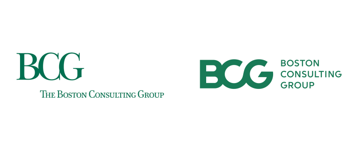
Last fall, Boston Consulting Group updated their logo and brand identity. Switching from a serif font to a more rounded, sans serif one and dropping ‘the’ from their name, BCG is signaling their ability to innovate in a increasingly technological landscape. However, their new logo oddly already appears dated and removes the reminder of the tradition and ethos of the company that the old logo held. This was one of the more drastic brand identity shifts I’ve seen within a corporate industry, so I thought it was pretty interesting choice.

More images of the old and new branding can be seen here.
